.png)


.png)


.png)


.png)


While we played a bit with branding, our brief was to design a Google app which meant coherence with the company's UX guidelines, so we outlined our design principles in a similarly purposeful, no-frills fashion:
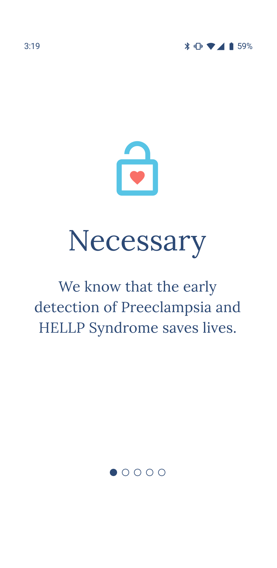
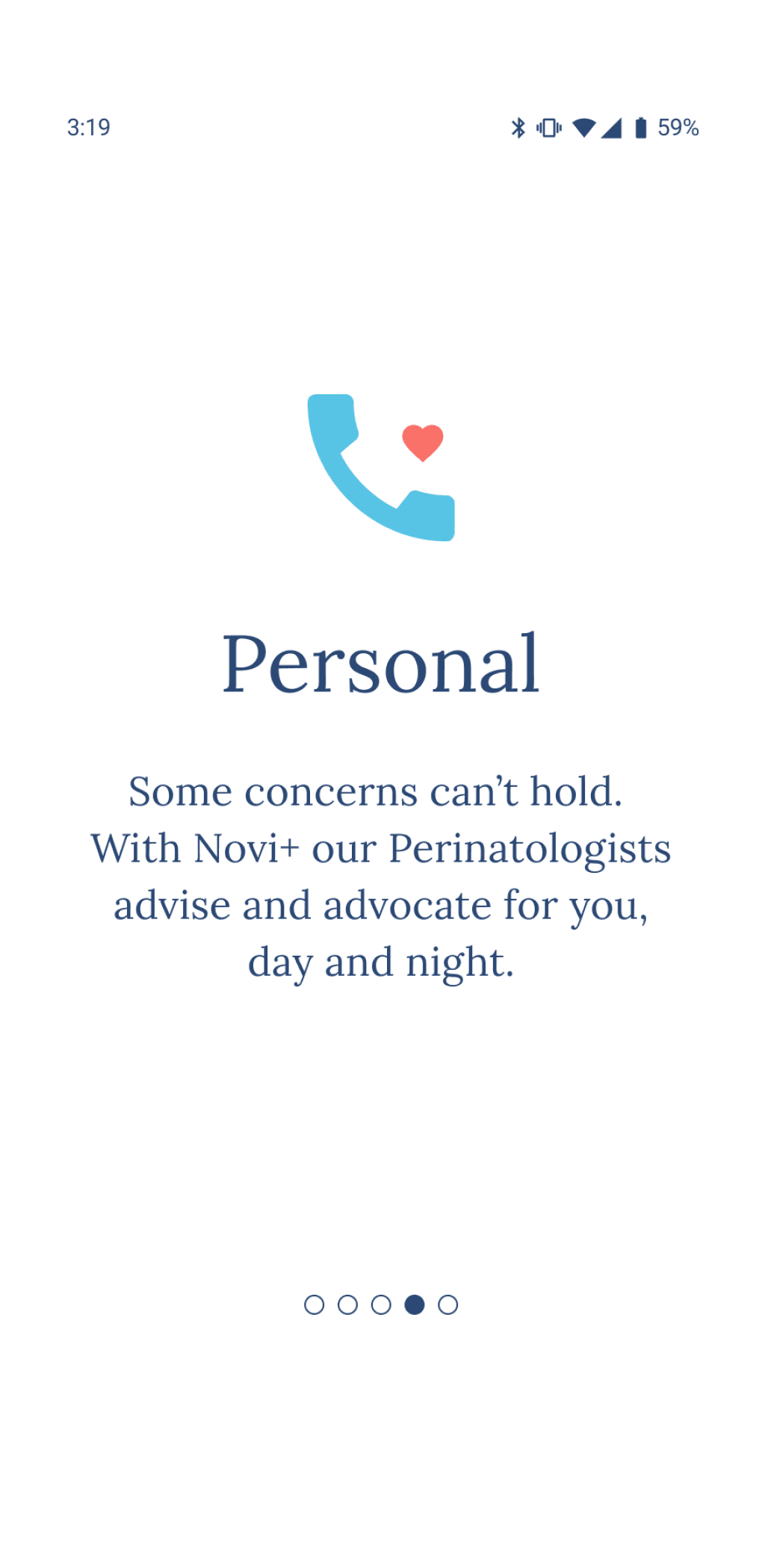
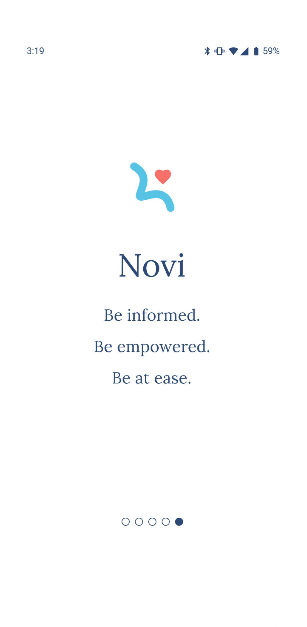
We wanted the app's clean appearance and streamlined flow to exude the kind of professional bedside manner anyone would feel confident putting their trust in.
No endless scrolling
Show the most important information first
Easy access to activities
Tabbed and nested content
.png)
Our feature roadmap and sitemap helped us identify and organize all the features we hoped to include in the app, but our project timeline forced us to prioritize the most crucial to demonstrate the concept.

Most of our early decisions revolved around organizing the user's activities and data and how to display it.
This required a lot of iterating to continually clarify why/what/where/how/by whom features would be used in various task flows. It wasn't always obvious.
.png)
For example, we wondered if there was redundancy in our reminders, to-dos and notifications. We began to combine them but then realized their purpose and ownership were different enough to potentially confuse the user, so we got nitty-gritty with our definitions.

With our guidelines reminding us keep our app's goals at the forefront, we divided our content into three main sections:
A Home page (health overviews and reminders) that keeps the user active and organized
A Health section (data collection and synthesis) that keeps the user educated
A Tools section (action plans and communications) that keeps the user prepared and supported
.gif)
We observed the usefulness of floating action buttons (FABs) in several data-tracking apps, and implemented a couple of our own.
They serve the user as both a consistent reminder and a convenient avenue in accomplishing tasks.
The FAB located in the Home and Health sections contains quick access to blood pressure testing, logging symptoms, setting reminders and adding appointments and other test results.
The categories are arranged by priority, with the user's current stage of their action plan taking precedence, and the other categories serving as an overview of their activities and health status.
.gif)
The Home page is organized by horizontally scrolling action cards, with button categories on top, and their corresponding action cards beneath.
Because everyone has different preferences with their task organizers, we wanted the user have a fair amount of editing power so that reminders and data displays fit their personality and lifestyle, making them more likely to use them consistently.
The Health section makes it easy for the user to observe the many often unseen and unfelt changes in their bodies over time. The tests, symptom log and calendar activity overview are meant to put the pieces together with holistically-informed understanding and continually guide them toward their action plan.
We struck a balance and promoted clarity and accessibility with copy, color, icons, shapes, patterns, tabs and toggles.
.gif)
We found our biggest challenge of the project in the form of data visualization. With so many types and timespans to represent inside limited space, the risks were to be visually overwhelming and hard to read, or so broken down that they weren't understandable as a whole.
And now for the highlight of this project: the blood pressure cuff smart watch! This is how Novi meets the user's need for more control over their health information. By allowing blood pressure readings anytime and anywhere, the larger sample of results can be averaged and contextualized for better accuracy.
While test results can be viewed on the watch, the much smaller screen size required paring down most content and providing links to see more in the phone app.
We still placed a priority on activities and information that funnel the user toward their action plan and support system, like reminders that let them request an appointment right from their wrist.
.gif)
.gif)
.gif)
The FABs were translated into sliding drawers, accessible at any time with a swipe to the right or left.
The Tools section helps alleviate confusion and anxiety by reminding the user that they have a plan and they have support.
The action plan, determined by AI and validated by specialists, explains why the user is placed in their current plan and suggests helpful actions to manage the progression of disease.
The other tabs include an email-like messaging system and a medical notes file. If the user integrates their primary healthcare app, they'll be able to keep all their communication in one place, and if not, they can still involve other team members via messaging and sharing.
We intended for the FAB in the Tools section to be different and reflect its particular purpose, so the buttons here allow for sending messages, speaking with the on-call specialist or requesting an appointment.
This way the user is able to quickly communicate whenever they feel the need, no matter how deep into the section they are.
.gif)
.gif)
.png)
All of our test participants were target users between 30-40 years of age; three with previous preeclampsia and/or HELLP syndrome diagnoses and two with no diagnoses that were expecting their first child.
Participants were asked to complete a series of three tasks in the areas of onboarding, testing their blood pressure and accessing their data and action plan.
Error-free Rate
Completion Rate
Task 1: 100%
Participant 1: 66.6%
Participant 2: 33.3%
Participant 3: 33.3%
Participant 4: 66.6%
Participant 5: 33.3%
Task 2: 100%
Task 3: 80%
It turned out that participants thought they'd find contact details or app troubleshooting in the "My Help" section, not their action plan.
100% of users struggled to find their action plan.
Insight
Problem
Potential Solution
We relabeled "My Help" as "Tools" to clarify that section's contents.
Most misclicks were due to limitations with the mid-fi prototype or test method, but a few design problems stood out either from consistency or importance:
Insight
Problem
Potential Solution
The copy "Average Blood Pressure" indicated to a user that their blood pressure results were average, when the results listed were actually high.
We rewrote "Average Blood Pressure" as "Your average blood pressure is ___" to avoid confusion.
A participant misunderstood the blood pressure results.
Insight
Problem
Potential Solution
The participant thought the first card might be linked to more stats because the lower one appeared to be a CTA.
We placed blood pressure information copy directly on the screen and made the "Recommendations" card a CTA button for more clarity.
A participant clicked on the Blood Pressure Stats cards instead of using the tabs.
Insight
Problem
Potential Solution
It may have been due to feeling pressure to move quickly, but it also could've been instinct to use a search tool.
Some participants headed to the hamburger menu to find things instead of exploring via nav bar.
More testing might show a need for a search feature, but first we dumped the hamburger menu content into the avatar pop-out menu to guide the user toward the main sections.
.gif)
This participant initially clicked on "My Health" to find her action plan before finding it in the "My Help" section.
As soon as this participant realized the menu was non-functional, she used the nav bar.
This participant was drawn toward using the cards instead of the tabs.
.gif)
.gif) View more test findings
View more test findingsIf you'd like to explore the final prototype, click here.
.png)
I got really attached to this project and would love to see this app become a reality, so there's a lot more I want to design and test:
Completion To-Dos
Create flows and screens around symptom logging (including notes about completed action plan items) and adding external test data (including the onboarding flow integrating other health-related apps).
Create a desktop site for the specialist's side and for users to see their data on a larger screen.
A/B testing with health (including data production effects on early warning systems, action plan effects on morbidity/mortality outcomes, and if on-call specialists improved understanding, confidence and self-advocacy for app users) and financial outcomes (including savings on in-person appointments and emergency interventions).
Future versions might include features for gestational diabetes and other pregnancy-related diseases.
Testing To-Dos
Future To-Dos
Completion To-Dos
Create flows and screens around symptom logging (including notes about completed action plan items) and adding external test data (including the onboarding flow integrating other health-related apps).
Create a desktop site for the specialist's side and for users to see their data on a larger screen.
I got really attached to this project and would love to see this app become a reality, so there's a lot more I want to design and test:
A/B testing with health (including data production effects on early warning systems, action plan effects on morbidity/mortality outcomes, and if on-call specialists improved understanding, confidence and self-advocacy for app users) and financial outcomes (including savings on in-person appointments and emergency interventions).
Future versions might include features for gestational diabetes and other pregnancy-related diseases.
Testing To-Dos
Future To-Dos
.png)

