.png)
Branding and strategy for a small toiletries business
Branding and strategy for a small toiletries business
Beautiful Day Co. is a new natural toiletries company in Gresham, Oregon with little online presence. I provided research and strategy around online sales, specifically subscriptions, but the biggest challenge of this project was creating an original brand, which I developed by highlighting the owner’s location-oriented memories.
Beautiful Day Co. is a new natural toiletries company in Gresham, Oregon with little online presence. I provided research and strategy around online sales, specifically subscriptions, but the biggest challenge of this project was creating an original brand, which I developed by highlighting the owner’s location-oriented memories.
After doing some research (don't worry, you'll see more of that below), I landed on a 25-65 year old target market of humans with some extra cash to spend on high-end self-care products. Woman humans, you might be thinking, but you'd be wrong, my friend. It turns out that people of all genders enjoy being clean and smelling good and having a nice-looking abode, but not everyone was making the effort to market to them! With loads of toiletry companies recently seeing the potential of male and non-binary consumers, I knew it would be downright foolhardy to ignore them and not cash in, too.
And yet, my first stab at creating a look for the company was still a traditional spa vibe, with a medicinal-looking layout and extremely classy fonts. Some specific feedback was "meh."
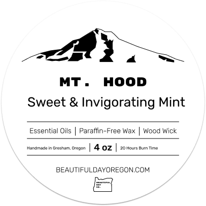
Whilst on a walk beholding some glorious Oregon nature, I mused on the owner putting herself into her products (personal scent preferences, homage to her parents' name, donating profits to local charities) and tirelessly experimenting with her recipes until they were perfect. Such a personal offering deserved an inviting, unique style with broad appeal to its customers.
The owner was born in the 1950s here in Oregon and has never wanted to live anywhere else. Knowing that smell is closely linked with memories, we paired natural scents with many of her vivid Oregon experiences, naming each recipe for a popular locale around the state. Residents and visitors will be able to celebrate their own Oregon memories each time they use the products and at the same time, be reminded that they are supporting a small, local business, which is definitely maybe super important to them.
The images and font were inspired by vintage national park posters, much like ones the owner would have seen on her childhood trips, and I opted for a stark color palette of black, white and cobalt blue. This was to let the locations themselves grab all the glory, to give a nod to old-school blue medicine bottles, and so the brand would stand out from competitors' natural color palettes. Popping these unisex bad boys people on some plain black, white and blue containers will be the perfect mid-mod gender-neutral decor.
Once the images and fonts came together, creating a logo was much more streamlined. I knew it needed to stay simple but give the customer information about the company at a glance.

.png)
After doing some research (don't worry, you'll see more of that below), I landed on a 25-65 year old target market of humans with some extra cash to spend on high-end self-care products. Woman humans, you might be thinking, but you'd be wrong, my friend. It turns out that men also enjoy being clean and smelling good and having a nice-looking abode, but not everyone was making the effort to market to them! With loads of toiletry companies recently seeing the potential of this section of consumers, I knew it would be downright foolhardy to ignore the mens and not cash in, too.
And yet, my first stab at creating a look for the company was still a traditional spa vibe, with a medicinal-looking layout and extremely classy fonts. Some specific feedback was "meh."
Whilst on a walk beholding some glorious Oregon nature, I mused on the owner putting herself into her products (personal scent preferences, homage to her parents' name, donating profits to local charities) and tirelessly experimenting with her recipes until they were perfect. Such a personal offering deserved an inviting, unique style with broad appeal to its customers.
The owner was born in the 1950s here in Oregon and has never wanted to live anywhere else. Knowing that smell is closely linked with memories, we paired natural scents with many of her vivid Oregon experiences, naming each recipe for a popular locale around the state. Residents and visitors will be able to celebrate their own Oregon memories each time they use the products and at the same time, be reminded that they are supporting a small, local business, which is definitely maybe super important to them.
The images and font were inspired by vintage national park posters, much like ones the owner would have seen on her childhood trips, and I opted for a stark color palette of black, white and cobalt blue. This was to let the locations themselves grab all the glory, to give a nod to old-school blue medicine bottles, and so the brand would stand out from competitors' natural color palettes. Popping these unisex bad boys people on some plain black, white and blue containers will be the perfect mid-mod gender-neutral decor.
Once the images and fonts came together, creating a logo was much more streamlined. I knew it needed to stay simple but give the customer information about the company at a glance.
View more labelsBefore I began research, I outlined some assumptions I had about the online toiletries market:


Before I began research, I outlined some assumptions I had about the online toiletries market:
To my surprise, I found many research participants do buy personal products online, but vary in comfort level according to product. And while they see the upsides to subscription services, very few of them make the leap or sustain the service if they do. Several people commented that they got smothered by a pile of products they had no use for and others said they preferred running to the store in a panic when they ran out of something.
Remember how I thought it would be super important to people to purchase from small, local companies? Nope. There was an unpredictable inconsistency in the "values market": while almost 70% were intent on buying natural/organic products, the inverse was true for purchasing locally or from small businesses.

Online purchasing: instant gratification, making returns, and being able to smell and touch products.
Subscriptions: inflexibility of delivery frequency and duration, and potential waste of money and product.
Local and/or small businesses: lack of availability and accessibility.
Subscriptions: lack of control over uncustomizable product "sets" being sent.
Kelsey and Mitch are different aspects of my research data in the imaginary flesh. Their thoughts, values and shopping habits were helpful to keep in mind while I created user task flows and features, as well as planning products, policies and procedures for the company.
Kelsey and Mitch are different aspects of my research data in the imaginary flesh. Their thoughts, values and shopping habits were helpful to keep in mind while I created user task flows and features, as well as planning products, policies and procedures for the company.
Clearly, the solution to the problems presented during the research phase was going to have to address concerns with value, convenience and control. It seems competitors who nail the subscription model prove the value of their products and loosen the restrictions and rules.

.png)
Clearly, the solution to the problems presented during the research phase was going to have to address concerns with value, convenience and control. It seems competitors who nail the subscription model prove the value of their products and loosen the restrictions and rules.
I sketched some wireframe ideas, then created mid-fidelity screens for desktop and mobile in Figma. E-commerce sites have been around for a long time, so this is nothing you've never seen before and you can feel free to skip to the next section.


I sketched some wireframe ideas, then created mid-fidelity screens for desktop and mobile in Figma. E-commerce sites have been around for a long time, so this is nothing you've never seen before and you can feel free to skip to the next section.
Initially, I used Maze to test two mid-fidelity user task flows, and let's just say the results were abysmal because I didn’t link every single element on every single page. Once the half of testers that bumbled their way through got to the exact product page they needed, checking out was a breeze, and after I add 1.8 million links to the prototype and test again, I expect a 100% completion rate.
View user task flow #3View affinity mapInitially, I used Maze to test two mid-fidelity user task flows, and let's just say the results were abysmal because I didn’t link every single element on every single page. Once the half of testers that bumbled their way through got to the exact product page they needed, checking out was a breeze, and after I add 1.8 million links to the prototype and test again, I expect a 100% completion rate.
View user task flow #3View affinity mapI made layout and font revisions on all screens to promote visual space and legibility, but the biggest changes were made after some excellent feedback about focus and cohesion around subscription promotion and CTA language. I added a new homepage section devoted to subscriptions, and made all of the CTA copy less generic and more consistent with the site's playful tone.
Finally, everything got prettied up by adding (provisional) images, elements and color treatments from the UI kit.
I made layout and font revisions on all screens to promote visual space and legibility, but the biggest changes were made after some excellent feedback about focus and cohesion around subscription promotion and CTA language. I added a new homepage section devoted to subscriptions, and made all of the CTA copy less generic and more consistent with the site's playful tone.
Finally, everything got prettied up by adding (provisional) images, elements and color treatments from the UI kit.
.png)
In order to finish the site, we need to print labels, get product photos taken, and develop the site. Once it's up and running, we will begin marketing, monitoring and measuring KPIs, and making adjustments to absolutely everything, as needed. Gathering more market data on subscriptions will be a priority. I'm curious about mobile versus desktop sales, and how we may need to adjust design to accommodate preferences, so further testing will be needed there as well.
In order to finish the site, we need to print labels, get product photos taken, and develop the site. Once it's up and running, we will begin marketing, monitoring and measuring KPIs, and making adjustments to absolutely everything, as needed. Gathering more market data on subscriptions will be a priority. I'm curious about mobile versus desktop sales, and how we may need to adjust design to accommodate preferences, so further testing will be needed there as well.
.jpg)

.jpg)


.png)